
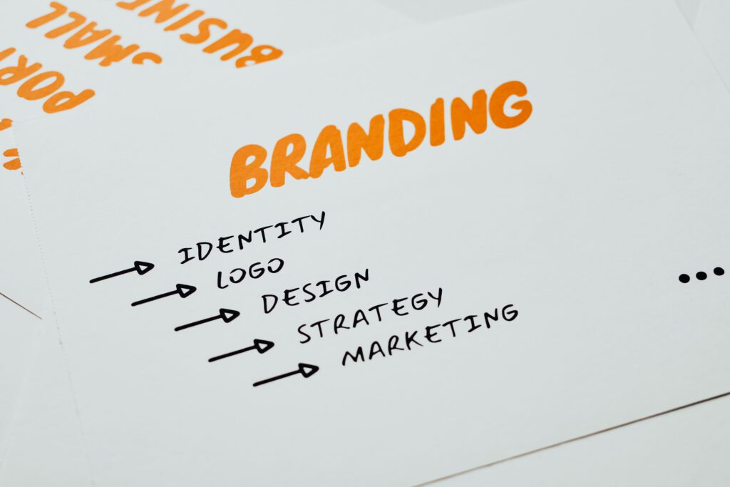
When a small business says it needs branding, it usually means it needs a logo. A logo is the smallest part of the job and the last part that should be decided. What actually makes a small team look like a serious one is consistency, and consistency is cheaper than a rebrand.
Build it in this order
First, decide what you sound like. Before any visual decision, write down how you talk. Do you say “purchase” or “buy”? Are you the expert or the guide? Three or four sentences is enough. Everything downstream gets easier, and it costs nothing.
Then type. One typeface for headings, one for body, and a fixed set of sizes. Nothing makes an amateur site look amateur faster than six font sizes chosen by whoever was editing that day. This single decision does more visual work than a logo.
Then colour, sparingly. Most small brands need one accent colour, a couple of neutrals, and rules about where the accent is allowed to appear. A palette of eight colours is not richer, it is just harder to use consistently.
Then the logo. By now you know the tone, the type and the colour, so the logo has something to be consistent with. Designed first, in a vacuum, it tends to get redone within two years.
The part that gets skipped
Write it down. A single page covering the fonts and sizes, the colours with their exact values, when to use each logo version, and how you write dates, prices and headings. Without it, every new hire and every freelancer makes their own guesses, and the brand drifts inside a year.
One page, kept current, is worth more than a forty-page guideline nobody opens.
When a rebrand is actually the answer
Genuinely sometimes it is: if the name no longer describes what you sell, if you are moving upmarket and the current look prices you wrong, or if you have merged. Those are strategic problems that a visual refresh can solve.
“We are bored of it” is not on that list. Your customers see your brand a fraction as often as you do, and consistency is doing more work than novelty ever will.